Insights
Whether I’m trying to get to Barnard Castle, or understand how to get better at my job, I need some guidance to understand the roads / steps I need to take to get to my end point – my goal.
These days, I use my iPhone for travelling because I like the simplicity of the way it presents the map and directs me with optimal efficiency. It’s very different from the days of pulling out the A3-sized roadmap, finding my destination in the back-pages of the index, identifying the page and map reference and then navigating back to my starting point to plan my journey – what a faff!
It’s the same with performance management systems in work.
Over the years, I’ve used quite a few of the leading providers and I always had a sense of being overwhelmed by so much data. I didn’t know where to start. To manage a team, did I really need access to tens and tens of different report types?
That’s one of the reasons why I co-founded EvaluAgent. But that’s another story…
Here, I thought it would be useful to share a few thoughts that led us to build our reports the way we did.
I just need to know two things…
It really is simple – As a leader, to help focus feedback, coaching and improvement activity, I need to know:
- What part of the organisation requires attention?
- What part of the customer experience requires attention?
What part of the organisation requires attention?
The organisation part may be a department, shift, team, agent or a group of new recruits fresh onto the phones.
Based on my experience of managing large scale operations and building lots of MI and performance tools over the years; the foundation is a reporting structure that enables you to click through performance from the very top to each individual level. By doing this, you should be able to highlight over performers and under performers at each level.
OK, that might sound a bit obvious. But having worked with hundreds of clients over the years, I’ve seen some very complicated organisational reporting structures that are complex to say the least and almost impossible to understand. Leaves you feeling a bit like this…

As well as reporting performance aligned to your org structure, you’ll also need to be able to quickly group colleagues together into Customised Reporting Groups to help track performance on focused areas. That might be new starters separated across different teams but grouped together based on tenure in a “virtual grad bay”. It might be a test learn project where a selected group of agents are trying out a new way of dealing with customer queries
Again, it might sound obvious, but if your reporting is still based on spreadsheets, you may be burning hours and days of precious leadership time crunching numbers and pivoting tables in Excel. Great if you love number crunching, but as a leader is that truly where we add value?
One last tip on using reporting to highlight what part of the organisation requires attention…
Over the years, of all the statistical tools available, Quartile Analysis has to be the best for improving overall performance. Using the technique to identify, target and then move performers up between quartiles is one of the best ways of focusing everyone’s attention and moving the dial across a large operation.
What part of the customer experience requires attention?
It starts with developing performance management frameworks (E.g. quality scorecards) to properly reflect the business and customer outcomes that are most important to your business.
Check out our Ultimate Guide to Quality Scoring.
With the right measurement framework in place, you can then develop reporting capabilities that enable you to efficiently pinpoint customer experience, process adherence, and regulatory risk outcomes that are causing customer and business issues.
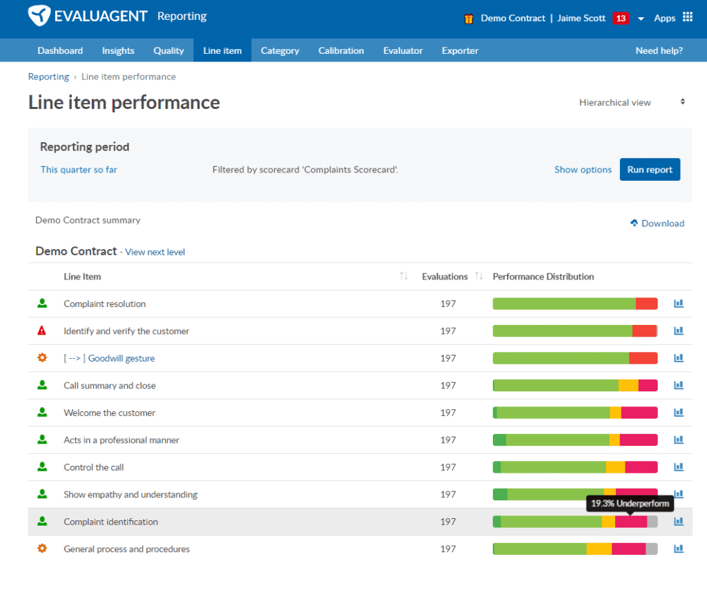
Here, it’s clear to see that across 197 evaluations, complaint identification has been deemed to be an under performing outcome almost 20% of the time. So let’s start there by clicking into that to reveal root cause information. We can then better understand if there are pockets of agents driving this outcome – again – what’s going wrong and where.
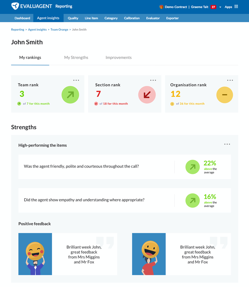
Give agents access to their own performance data
So that advice is all great at helping leaders, team managers and coaches to identify where to focus attention. But coming back to the map analogy for a moment – How many of us have arguments with our partners when we’re driving because they chose the wrong route?
Is that why I prefer the dulcet (accurate) tones of my iPhone assistant now? It’s certainly reduced the car arguments with my wife; although having lived in London, she still approaches roundabouts way too aggressively and fast!
Sorry, I digress. The point is this – If I’m going to be responsible for my own performance, should I not have direct and timely access to MY performance data so I can identify what part of the customer experience I’M delivering is working well and which part of it requires MY attention?
Obvious? Not so much. It’s a bit scary that quite a few operations still prefer to spoon-feed performance data to agents as part of a monthly or quarterly performance review meeting.
When we ask the question why? Cost is sometimes mentioned – specifically, the cost of reporting software licences. But surely, the lost opportunity cost of leveraging colleagues’ motivation and self-awareness to drive their own performance improvement is greater?
I don’t have a clear, concise piece of research to share on this, but it’s certainly my experience that operations that provide more autonomy to customer-facing staff both in terms of operational policy and performance reporting, perform much better than those that don’t.
A healthy dose of competition
Sales and service desks wouldn’t be the same without a leader-board – and a smidgen of healthy competition goes a long way towards building rapport amongst the team.
And it’s not just for the top performers…
Ranking colleagues based on most improved or volume of feedback on positive behaviour helps build a positive culture based on the right outcomes and values and ensures that everyone deserving of attention gets a chance to be recognised for their hard work.
Lots of references on the pros and cons of leader boards, Talkdesk created a good explanation blog.
In my experience, if done correctly with consistency, the pros outweigh the cons, but as always be aware of the impact of unintended consequences.
Engaging Data
Finally, let’s face it, we’re not all data scientists…
So, to identify what we’re doing well, and understand what we need to improve, sometimes we just need to be pointed in the right direction.
It doesn’t have to be as good as FIFA-20, but surely, we all get a bit more excited when we see data presented in engaging styles, rather than just another bl**dy spreadsheet???
Of all the information transmitted to brain, 90% is visual. As opposed to text, visuals are processed 60,000x faster. (Elearning) This means agents can absorb their performance, reflect faster and get straight to what actions they can take to move forwards.
OK. Thanks for reading.
Time for the blatant product plug – This last bit of advice around agent performance data has been incorporated into our recent launch of some very powerful Team Engagement features.
To see how team engagement ideas such as this can help support your agents, team managers and business, I’d love to hear from you via email at jaime@evaluagent.com or why not connect on LinkedIn and let’s start a conversation.